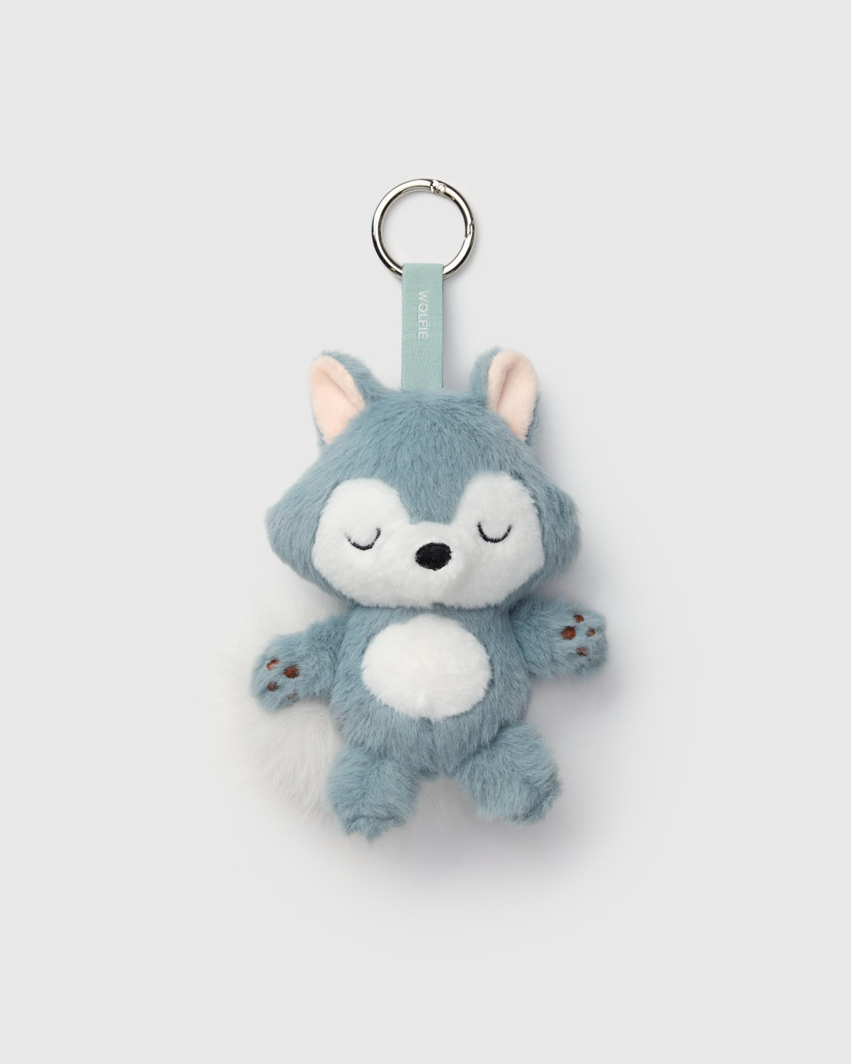
Unlike most 10 year olds, we’re heading into tween-hood and skipping the awkward years (IYKYK). In fact, as a brand, we’re officially maturing with the introduction of our new mascot: Wolfie!
We’re marking this exciting milestone by taking you behind the scenes with this interview with Toronto-based creative director, graphic designer, and mom of two, Stephanie Holden, who created Wolfie for us.

What excited you about working with Loulou Lollipop?
I love the thoughtfulness the team puts into their designs. The product is clearly designed by moms who care about quality and responsibility, as well as beautiful colours and charming patterns. Loulou Lollipop checked all the boxes for me of being women-owned, certified B-Corp, and based in Canada.
What inspired your final design?
After speaking with the founders, Eleanor and Angel, and the leadership team, we discussed how Loulou is a French term of endearment meaning “my little wolf”’ – like “my baby” or “my darling”. We explored a few different options, but it was clear that little Wolfie had the hearts of all of us to be the final direction.
Did anything unexpected influence your final design?
The whimsical typography in the existing wordmark influenced a lot of the shapes in Wolfie’s face. The thicker parts of the ‘o’ became Wolfie’s crescent moon eye shape, the counter shape of the ‘o’ influenced the nose shape, and the edges of the uppercase ‘L’ inspired the face shape.
 |
 |
What was your design process from concept to final version?
First and foremost, we did a deep dive on the product line so I could understand the signature details and what Loulou Lollipop is known for. From that I met with the founders and leadership team to discuss initial thoughts. Then, we moved into a research and mood board stage, followed by initial concepts, and then progressed over a series of reviews into the final design.
How did you incorporate our brand values into the logo?
Wolfie being a cute little animal spoke to the environmentally-mindful aspect of the brand, while his sweet sleepy face communicates the soft and comfortable side of Loulou Lollipop. We see Wolfie as being a playful and curious little wolf – just like the children wearing the product. The connection of “my little wolf” for the French meaning also ties back to the product being thoughtfully designed by moms.
 |
 |
What do you hope followers will feel when they see the new logo?
I hope fans of Loulou Lollipop will have a soft spot for Wolfie in their hearts like we do, and that Wolfie will remind everyone of the sweet “little wolf” in their own life.
 Canada
 United States


